A quick review of recent events
- Unemployment is trending lower, but is still very high.
- Unemployment supplemental checks ($600) are gone for now.
- GDP is worse than expected.
- Earnings are better, but they're based on lowered expectations.
- Inflation is rising slowly from a very low base.
- Bond prices are taking a hit lately.
- Gold and TIPS are leading the way higher.
- Covid is still with us, and a vaccine is not yet in sight.
Asset Class Returns 2017-2020
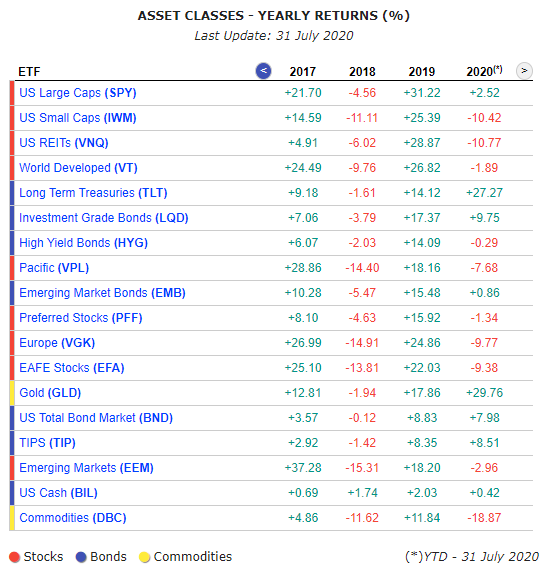
- In 2020, gold is king - up nearly 30% YTD through the end of July.
- Long-term U.S. Treasuries are a close second to gold.
- Investment grade corporate bonds are the 3rd best performing asset class YTD.
- TIPS come in 4th place on the leader board.
- And the total U.S. bond market clocks in at #5.
Is there a pattern here?
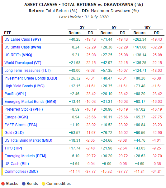
Asset Class Returns with Drawdowns
10 best performing stocks in August 2020
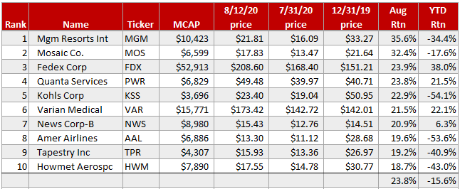
The below table is sorted by August performance. For context, it also shows YTD returns. Look to the far right columns for details.
MGM is the big winner in August. But the stock is down -36% YTD. This is a teaching moment. Always look at the time frame of published returns before you jump to any conclusions.
MOS comes in at #2 on the August leader board. This materials company produces and markets concentrated phosphate and potash crop nutrients. The materials sector has been on fire recently. But MOS is still down -19% YTD.
FDX is #3. They are benefiting mightily from the pandemic lockdown.
The Triple Cross Indicator
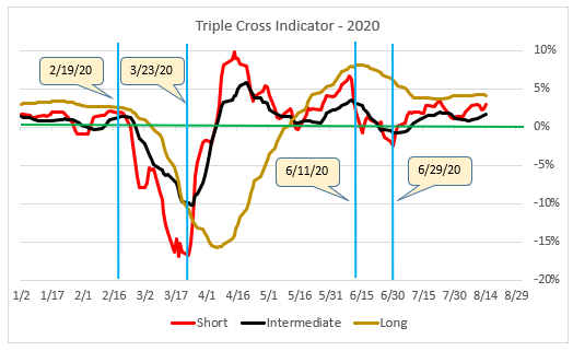
The Triple Cross chart plots three moving average crossovers - short, intermediate, and long-term. The idea is to give you a sense of market momentum at these three time frames.
In a normal upward trending market, all three lines will be above zero. In a bear market they will be below zero. In between, the short moving average (red line) acts like the canary in the coal mine and warns of possible trouble ahead. This line is very twitchy, so only the boldest traders should act on it.
The intermediate moving average (black line) isn't as twitchy as the red line. It avoids some of the whipsaws that the red line can cause. When the black line moves above or below zero it's a good indication that the intermediate trend in the market has changed.
The long-term moving average (brown line) serves as confirmation that what the other two lines are saying is sustainable. Each investor must decide for themselves how to use the information provided by the three moving average crossovers.
This market rally now has confirmation from the long-term moving average crossover (brown line on the chart). Even if the market pulls back next week, the brown line will probably stay above zero (the green line) anyway.
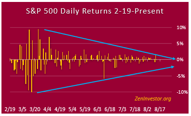
The Minsky Chart (compression of daily volatility)
Lastly, we have the compression of daily market swings. Four months ago we were seeing daily swings of 6% to as high as 10% in the market. Now we're down to 1% or 2% daily swings with an occasional 3% day.
The blue lines are still compressing.
One thing is certain: this chart configuration will not continue to look like it does now for very much longer. Volatility will return, as it always does. Especially as election season begins to heat up.
(If you would like to know more about Minsky, and why I named this chart after him, see this report.)
Final Thoughts
Two things I want to emphasize. First, we might be witnessing a shift away from growth and momentum to value bargain-hunting. This could change on a dime but it's the trend for now.
Secondly, everything in this article is based on technical factors. I haven't addressed fundamentals or the economy. I have to keep the article brief or risk violating the 1-minute rule.
While the technicals are looking better and better each week, the fundamentals are not. And while the employment picture seems to be improving, the economy as a whole is still in a deep hole that will probably take several quarters to climb out of.
My advice is to take advantage of this rally but be prepared for setbacks and more volatility going forward.

