
Here’s what happened last week,
and what to watch for next week.
Chart 1. S&P periodic returns.
Market cracked just a little bit on Friday. The first losing week since June. But it still looks good. As I’ve said many times before: Don’t fight the tape. If it’s down again next week I probably won’t sound so glib.
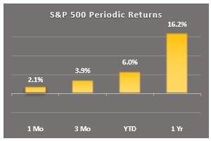
Chart 2. S&P drawdowns
Market now within 1.4% of its previous high. Once again the bulls failed to close the sale. We’ll be interested to see whether the bears will become more aggressive next week. Do they smell fear?
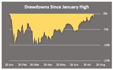
Chart 3. S&P key markers
This little table shows how far away the market is from key markers, like the previous low for this correction, and the key moving averages that technicians watch.
S&P is well above support (2581) and all three moving averages. Watch for a breakout above 2873 or a dip below 2784 (50 SMA). The chartists are watching, and they’ll probably get wound up when either marker is breached.
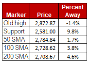
Chart 4. The market dashboard
I look at this dashboard after the close every day for a quick take on the market. It shows drawdowns, momentum, and volatility all on one graphic. Right now, the dip buyers have the upper hand. They have pushed the rally sellers up against the wall at 2872.
I’ll be watching closely to see which of these two camps ultimately prevails. My money is still on the dip-buyers for now. It would take some serious selling next week for me to budge, but with so many land mines out there, anything can happen.
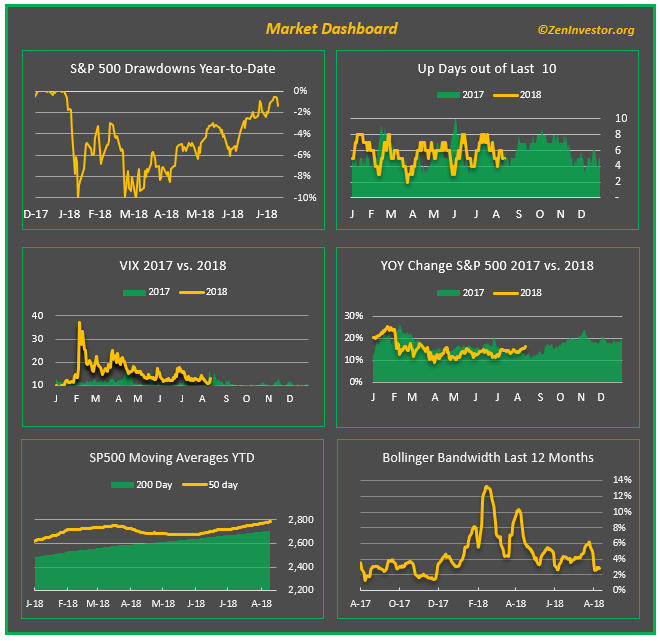
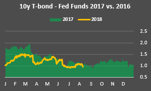
Chart 5. 10yr Treasury minus Fed Funds Rate (yield curve)
The pundits have been harping about the flattening curve since March, and this chart shows why. But here’s a fun fact: the curve isn’t really flattening, it’s compressing. And there’s a difference. Compression means going from 1.5 to 1 on the spread. Flattening means going from 1 to near zero. It may seem like semantics to us mere mortals, but to the bond vigilantes and stock market bears it’s meaningful.
Final thoughts
This has been another down-and-dirty recap of last week’s market action and some things to watch for next week. Comments so far have been very positive, and I thank all who took the time. I will keep tweaking this report, while also trying to keep it fairly consistent.
As always, if you like what you see, or have suggestions for improving this recap, leave a comment below, or email me at info@zeninvestor.org
Love it. The visuals of your graphics tell the whole story.
I like concise stuff!!
Thank you.