What happened last week.
What we're watching for next week.
The struggle between the bulls and bears has intensified. We're seeing big down days followed by big up days. This is typical market behavior around significant turning points.
The bulls have the Fed on their side, and the Fed is a formidable ally. But the Fed doesn't have much ammunition this time around. The yield curve is already inverted, and the 10yr bond looks headed for 1%. The Fed could begin another round of quantitative easing, but that would further increase our national debt above the already dangerous level we're at today.
So, the Fed finds itself between a rock and a hard place. Trump is urging Powell to cut rates more aggressively, but the bond market is telegraphing contempt for this strategy.
The Economy
The economic cognoscenti are split about the proximity of the next recession. Larry Kudlow says "I sure don't see a recession coming." But he said the same thing just before the last recession arrived.
Very few economists would deny that the global economy is slowing. But U.S. economists still think that we can escape the grip of a global recession because, hey - we're the biggest, best, and smartest economy in the world. Do you buy that? I don't.
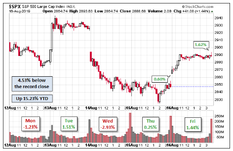
Chart of the Week - Tug of War
This table is a snapshot of last week's activity. There was a big decline on Wednesday which carried into Thursday and found a bid on Friday. For the week the market was down 1% - a nothing-burger.
Above chart is from Dshort
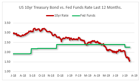
Chart 2. The Treasury Yield Curve
Last week the punditry got all excited by the fact that the U.S 10yr bond traded below the 2yr bond. The problem here is that this measure of inversion is old and stale. The more predictive version is the difference between the 10yr and the Fed Funds rate.
I first sounded the alarm in April 2019 when Fed Funds were yielding more than the 10yr bond. The chart below shows the track of both interest rates.
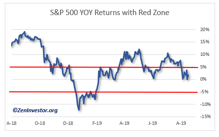
Chart 3. S&P Year-over-Year Gain With Red Zone Indicators.
One of the indicators I pay attention to is the year-over-year change in the price of an asset. In this case, the asset is the S&P 500 Index.
The chart below tracks this indicator over the last 12 months. This indicator is included in my stock market and recession models because it has above average predictive value.
The Red Zone is the area between +5% and -5%. When the S&P goes through the +5% level from above, it's a warning sign of further downward momentum.
When the S&P goes through the -5% level from below, it's a bullish sign. Today we find ourselves in the Red Zone but we can't know how this condition will be resolved.
Final Thoughts
The bears are circling but the bulls are not ready to give up the fight. For next week I'm watching for increasing volatility in the market, more scary headlines from the financial media, and opportunities to pick up great companies at bargain prices. Be selective, and let the market come to you.
If you want more info about how to set up a solid Plan B, see my articles on the subject here and here and here.
For a full analysis of the probability of a bear market or a new recession, check out my Monthly Intelligence Report.
As always, if you like what you see, or have suggestions for improving this recap, leave a comment below, or email me at info@zeninvestor.org


