What happened last week, and what it may mean for the market in 2020.
The Stock Market Report
It was a good week for the stock market. A fresh new high on Thursday. The 10-yr Treasury bond priced to yield a paltry 1.58%. A decent jobs report. Corporate earnings better than expected. Tesla stock is taking off like one of their rockets. Year-to-date gain of 3% on the S&P 500. Home builders can't work fast enough to keep up with demand. Junk bonds, REITs, Preferreds, and high dividend stocks are all approaching historical high prices. Private Equity and Venture Capital books are filled to overflowing. Happy Days are Here Again!
But there some cracks in the foundation, and experienced investors pay attention to them.
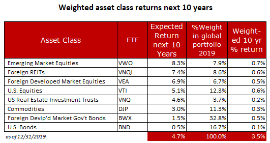
Chart 1. Expected Returns Next 10 Years
Without contradicting any of the positive statements listed above, it's helpful to also look at likely future outcomes for the assets we invest in. For this, we turn to James Picerno, a financial journalist who has been writing about finance and investment theory for more than twenty years.
Over the years, he’s written for the Wall Street Journal, Barron’s, Bloomberg Markets, Mutual Funds, Modern Maturity, Investment Advisor, Reuters, and his popular finance blog, The CapitalSpectator. Visit: The Capital Spectator (www.capitalspectator.com). The table below is based on his work.
Mr. Picerno explains his methodology: "With the necessary data in hand, we can calculate the implied risk premia with the following inputs:
1. An estimate of the Global Market Index (GMI) expected market price of risk, defined as the Sharpe ratio, which is the ratio of risk premia to volatility (standard deviation).
2. The expected volatility (standard deviation) of each asset.
3. The expected correlation for each asset with the overall portfolio (GMI).
What we end up with is a rational estimate of the expected 10-yr returns for each asset class in the GMP. It's up to each investor to pick and choose which of these asset classes to include in their portfolio. But the expected return, in aggregate, of the GMI is just 3.5% on a weighted 10-yr basis.
The takeaway is that you had better choose your asset classes wisely, lest you end up at the bottom of the return table.
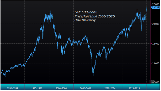
Chart 2. How expensive is this stock market?
There are many ways to slice and dice market data, but this one comes from a reliable source - Bloomberg. It shows the ratio of price to revenue for S&P 500 companies. Many observers agree that price/revenue is more meaningful than price/earnings, given the myriad accounting tricks that go into calculating earnings.
Suffice it to say that the market is stretched, which is why expected returns are so low.
Final Thoughts
To be honest, I underestimated the ability of the market to march ever higher as the valuations and internals were indicating that a top was near. Where it stops, nobody knows.
My advice to bulls is to stay bullish and keep on buying the dips. But have a contingency plan in place just in case history repeats and facts begin to matter again. My advice to bears is to tread lightly because sellers have been on strike since the last bottom on December 24, 2018. Until they return, the trend is higher and higher.
As always, if you like what you see, or have suggestions for improving this recap, leave a comment below, or email me at info@zeninvestor.org
Be sure to take advantage of our knowledge quizzes here.
And our free online courses here.


