The week just passed
It was the 3rd strong week in a row for the market, up 4.9% on the S&P 500. The rally off the employment report on Friday sealed the deal for the bulls. In a rally like this, bad news is ignored (pandemic, protests) and good news is amplified (job gains, re-openings).
Today I'll look at the stocks and sectors that benefited the most from last week's surge.
5 best performing stocks last week
The following three tables are sorted by 1-week performance. For context, they also show YTD and 52-week performance. Sector memberships are included in each table.
The first table shows the top performing stocks from last week. Two are industrial (specifically, airlines), two are energy, and one is a REIT. What's notable to me is that all five of these stocks were rebounding from deeply depressed levels. They were perceived as bargains rather than market leaders.
This might be a one or two week trend that fades later on, or it could be far more sustainable. I think it's likely to continue, at least for another few weeks.
7 best performing sectors ranked by 1 week performance (includes only the top 25 performing stocks)
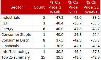
Next up is a summary of the top 25 stocks, grouped by sector. The same trend can be seen here - investors hunting for stocks in the most beaten-down parts of the market. Note that 8 of the top 25 stocks last week came from the consumer discretionary sector. That's where the action was.
Energy and industrial were well-represented too. There were perceived bargains in all three of these sectors.
All 11 market sectors ranked by 1 week performance (includes all 500 stocks)
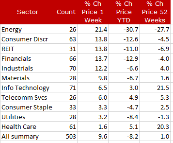
Lastly we have the average performance of all 500 stocks, again grouped by sector. The same trend is evident - bargain hunting. (The "Count" column is the number of stocks in each sector.)
Note that the defensive sectors - telecom, staples, utilities, and health care - lagged badly last week. Technology, which has been leading the market all year, also lagged. (BTW, the averages you see at the bottom of the table give equal weight to all 500 stocks, which is why they don't match up with the official cap-weighted numbers that are published in the media.)
The Triple Cross Indicator
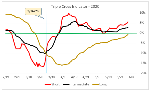
The Triple Cross chart plots three moving average crossovers - short, intermediate, and long. The idea is to give you a sense of market momentum at these three time frames.
In a normal upward trending market, all three lines will be above zero. In a bear market they will be below zero. In between, the short moving average (red line) acts like the canary in the coal mine and warns of possible trouble ahead. This line is very twitchy, so only the boldest traders should act on it.
The intermediate moving average (black line) isn't as twitchy as the red line. It avoids some of the whipsaws that the red line can cause. When the black line moves above or below zero it's a good indication that the intermediate trend in the market has changed.
The long moving average (brown line) serves as confirmation that what the other two lines are saying is sustainable. Each investor must decide for themselves how to use the information provided by the three moving average crossovers.
This extraordinary market rally is on the verge of getting final confirmation from the long-term moving average crossover (brown line on the chart). Even if the market pulls back next week, the brown line will probably cross above zero (green line) anyway. It's enough to give market technicians heart palpitations.
The Minsky Chart (compression of daily volatility)
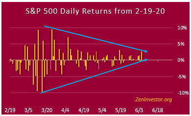
Lastly, we have the compression of daily market swings. Three months ago we were seeing daily swings of 6% to as high as 10% in the market. Now we're down to 1% or 2% daily swings with an occasional 3% day.
The blue lines have widened a bit lately, due to a 2.6% day last Friday and a 3.2% day on May 18. But the compression is still clearly seen. I was surprised that the jobs report, as good as it was, didn't move the market even more than it did. Could this mean that the buyers are getting closer to being fully invested? Or maybe most of the short covering has already taken place?
One thing is certain: this chart configuration will not continue to look like it does now for very much longer. Volatility will return, as it always does.
(If you would like to know more about Minsky, and why I named this chart after him, see last week's report here.)
Final Thoughts
Two things I want to emphasize. First, we might be witnessing a shift away from growth and momentum to value bargain-hunting. This could change on a dime but it's the trend for now.
Secondly, everything in this article is based on technical factors. I haven't addressed fundamentals or the economy. I have to keep the article brief or risk violating the 1-minute rule.
While the technicals are looking better and better each week, the fundamentals are not. And while the employment picture seems to be improving, the economy as a whole is still in a deep hole that will probably take several quarters to climb out of.
My advice is to take advantage of this rally but be prepared for setbacks and more volatility going forward.


Please advise the Moving Averages used on your Triple Cross Indicator. Your assistance in this regard will be appreciated.
Short = 3/21 SMA
Med = 10/21 SMA
Long = 21/210 EMA