A quick summary
- The market continues to make new highs.
- Consumer confidence and spending are high.
- Vaccines are plentiful and they are working.
- Businesses are reopening.
- The housing market is booming.
- Auto sales are picking up.
- The Covid recession may have already ended.
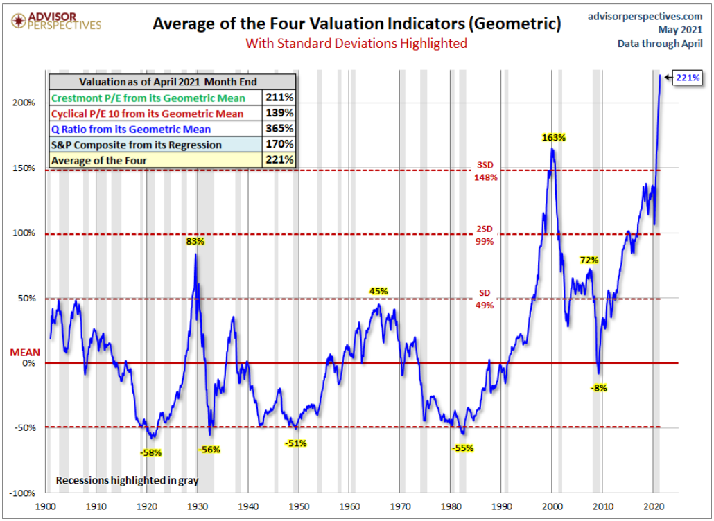
The S&P 500 continues to make new highs as the valuation bubble continues to inflate.
The market is now priced at more than twice its' fair value, based on four popular valuation metrics. The chart below is from Jill Mislinski at Advisor Perspectives.
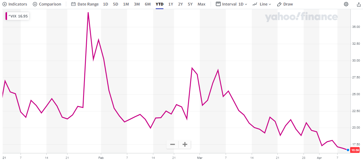
Volatility has declined, perhaps indicating complacency.
The long-term average for volatility, as measured by the VIX index, is around 13. Today it's 16.8. You can't read too much into the VIX numbers but clearly investors are becoming less anxious.
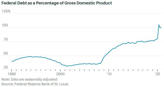
The elephant in the room.
The chart below shows that federal debt is now 100% of U.S. total GDP. Is this a problem? Not as long as the economy grows faster than the debt. But this chart doesn't include the most recent round of stimulus checks or the possibility of a large infrastructure bill.
If the economy should stumble, or if interest rates should climb faster than the FED likes, or if inflation should begin to surge, market valuations could begin to revert back to normal levels. That could cause a negative feedback loop for asset prices.
Final Thoughts
The market has been on a tear for more than a year now, with no end in sight. I'm advising clients to stay invested until the music stops. How will we know when the music has stopped? Watch the dip-buyers.
For the past year they have rarely allowed the market to decline by more than 5% before stepping in to save the day. Watch for a decline of 5%, followed by a rally that fails to make a new high.
If the market then declines to, or close to, 8%, it could mean that the dip-buyers are losing some of their confidence. And without them, the sheer weight of nosebleed valuations and massive debt could stop the music.
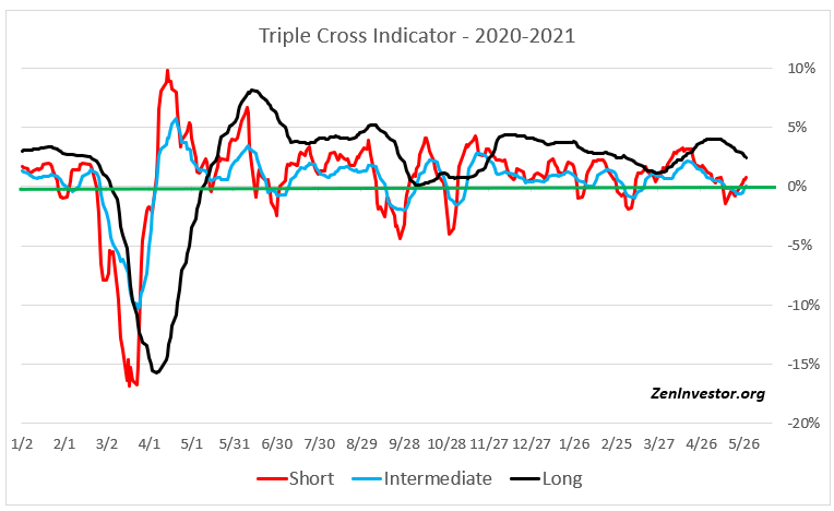
Triple Cross Indicator
This chart tracks the movement of three moving averages - short, intermediate and long-term. When all three lines are above zero (the green line), as they are today, investors can maximize their allocation to risk assets like equities.
As the lines begin to fall below zero (usually one at a time), investors can dial back their risk exposure in increments. The allocation model I use with this indicator never goes below 25% equity and 75% cash or cash equivalents.
The model has performed well, returning 28.4% in 2020 vs. 16.3% for the S%P 500. So far this year the model is on track to return 25.4%, based on its current trajectory.
If you want more information about the Triple Cross Indicator and the allocation model I use with it, email me at info@zeninvestor.org


Another outstanding article! When the music stops, will it be for the big plunge?
You betcha!