
Okay, that was a little intense. Now that we’ve had our long-awaited 10% correction, where do we go from here? I have some ideas.
Highlights
- Key Market Indicators remain supportive for stocks.
- The underlying data is churning a bit.
- Our asset allocations held steady.
- My final thoughts call the Greater Fools by their name.
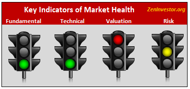
Key Market Indicators (KMI)
The KMI is a visual summary of current stock market conditions. It helps to answer questions like “How aggressive should I be with my asset allocation?” or “Should I put new money to work right away, or should I wait for a pullback?”
Brief summary, with details to follow:
Fundamentals are still strong, even after the recent market turmoil.
Technicals are still strong, although not quite as strong as they have been recently.
Risk is still flashing yellow. Recession threat is low, bear market threat is moderate, and volatility threat is high. Why is volatility threat high? Volatility has returned to the markets, and is unlikely to go away anytime soon.
Valuations are the sole red light. They have come down somewhat from recent levels, due to rising earnings and falling stock prices, but they are still well above the long-term trend line.
The Data Driving the KMI Traffic Lights
I said at the top that the underlying data that drives the traffic lights are churning, and this is normal. In a complex adaptive system like the economy and the markets, data is always churning. The reason I mentioned it at the top is because the amount of churning has increased, although not to a point of concern. Stay tuned.
Last month I revised the numbering system for the indicators to make it easier to read the tables (I call them boards). To simplify the process, I converted each of the numerical values to a simple scale of 1 through 9. (1 is good and 9 is bad.) I hope this will make the boards easier to understand.
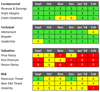
Fundamental is the healthiest of the four categories of indicators in the model. Revenue and earnings are still in an uptrend, and they appear to be getting a short-term boost from the corporate tax cuts. Profit margins remain at historically high levels, as wage growth remains sluggish. And credit conditions are easy, as evidenced by the narrow spread between junk bonds and U.S. Treasuries.
Technical is still green but it has slipped a little from last month (churn). We had a correction in February, and stock prices are struggling to get back to their previous form of making new highs. Breadth & leadership also slipped just a little, and new highs have been AWOL for weeks.
Valuation is the black sheep of the four indicators. Ironically, the more the market falls, the better it is for valuation. It relieves some of the pressure, like a safety valve.
Risk is still yellow, and it is now leaning slightly towards red. There is still no recession in sight, and the economy is chugging along at a 2.5-3% clip. So, why is risk flashing yellow? Primarily due to the reawakening of volatility, and the recently observed uptick in rates and inflation. Stating the obvious, yellow is not red. So don’t make too much of this reading.
My forecast for the U.S. Stock Market
(Probability of various outcomes over the next 12 months.)
- Continuation of the bull market: 62%
- A stock market “melt-up”: 7%
- Correction of 10-15%, with full recovery: 19%
- Decline of 20% or more, with no recovery: 12%
Bear Market Probability Gauge
This is a tool that my clients and subscribers can use to help them make critical asset allocation decisions. This is not a market-timing tool. It’s a dynamic reading of the probability that a new bear market will arrive sometime in the next 12 months.
Armed with this information, investors can decide for themselves how to use it. Highly risk-averse investors might cut back on equity exposure when the risk is 20% or higher. Less risk-averse investors may decide to wait until the probability reaches 30%, or 40%, or whatever threat level triggers them to play defense.
As of today, February 23, 2018, the probability of a new bear market arriving within the next 12 moths is 12%. That is up from 8% last month, primarily due to the correction and the absence of new highs.
U.S. Markets
I was happy to see that my clients and subscribers (that means you) kept calm, stayed invested, and resisted the temptation to get ahead of the indicators. Some of you took the opportunity to nibble at some names that were unfairly punished during the recent correction. That’s the way to do it, so congratulations.
The jury is still out regarding the question of whether we have seen the worst of this pullback. Keep your eyes on the indicators you see here, and be prepared with your Plan B, should it become necessary to call it up for duty. There’s little doubt that the market has entered a new phase, with increased volatility and higher risk than there was before the correction. Your Plan B might include raising some cash (not more than 20% at this time), buying long-dated, out-of-the-money puts on the S&P 500, or whichever index your portfolio most closely tracks. It could include taking a position in SH, the ETF that tracks the inverse of the S&P 500. Another idea would be to shift part of your equity exposure to U.S. Treasury bonds. The 10-year bond is a decent hedge against spikes in volatility, and TIPS are a decent way to mitigate the effects of a spike in inflation.
Your Plan B should be tailored to your needs and circumstances. If you don’t have one, consider getting some coaching or consulting that focuses on defensive opportunities specifically.
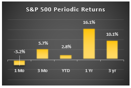
Here is a quick snapshot of what the market has done over various time frames. Note that the Year-to Date number has dropped from 22% down to just 2.8%. That’s because the starting point changed from December 31 2016 to December 31 2017. The 2.5% gain year-to-date is still above average, although a far cry from the record 7.5% reading last month.
My Market Dashboard

Observations
Drawdowns have now broken out of their narrow range. We had a correction in February, although it only lasted one day. Is that all there is to this pullback? Or might we see a retest of the recent lows? It’s impossible to know for sure, but my money is on new highs before lower lows.
Up days out of the last 21 (one month) have been running above average all throughout 2017. This is an interesting indicator to me because it’s a different way to gauge investor sentiment. The median is 11 up days per month, and 10 down days. When we see readings of 15 or more, it means there is a solid bid below the market, and the buy-the-dip crowd is dominant. Right now the reading is 13 – mildly bullish.
VIX and Bollinger Bandwidth both broke out after having been subdued for the past year. There’s a widely-held belief among traders that high volatility begets higher volatility. That may or may not be true, but I don’t think we are going to see readings as low, for as long, as we did last year.
Moving Averages are still giving positive signals. The gap between the 10-day and 200-day averages has narrowed. That usually means that upward momentum is fading.
My forecast for the U.S. Economy
(Probabilities of various outcomes over the next 12 months.)
- Moderate expansion of 2.5-3%: 72%
- Strong expansion of 3.5-4.5%: 8%
- Growth recession of 1-2%: 11%
- Outright recession with negative numbers: 9%
Key Recession Indicators
The risk of the US economy sliding into recession in the next 6 months is very low – just 10% as of the end of February. We base this estimate on a combination of factors (see the table below) that have proven accurate in calling turns in the business cycle. Our model will tell us when the conditions are in place for a turn in the business cycle.

R-Score. This indicator combines the treasury yield curve, inflation, and unemployment.
Employment. YoY % Chg. in private non-farm employment.
Ind Production. YoY % Chg. in industrial production.
Credit & Debt. Difference between Junk bond yield and Treasury bond yield.
Market Trend. YoY % Chg. in the S&P 500 index.
Market Stress. Combination of stock market price change and the unemployment rate change.
Market Internals. Momentum, Breadth, Leadership, Correlations.
Earnings Trend. YoY % Chg.; Beats; Revisions; Upgrades.
Volatility. VIX index; Bollinger Bandwidth; Daily Trading Range.
The latest readings (for February 2018) show a slight deterioration from last month’s fantastic numbers. The two leading indicators, Market Stress and Market Trend, are forecasting continued economic growth and positive market momentum for the next 3 to 6 months. The coincident indicators are confirming this outlook.
The takeaway from all of this is that the economy is strong enough to support the stock market. In the absence of a recession, corrections in the stock market are limited in scope and duration. It’s not unusual to see a 10% to 15% decline in the market without a recession taking place.
Final Thoughts
I’ve said this before – we’re in the Greater Fool stage of this bull market. With high valuations, rising rates and inflation, ballooning debt and deficits, rising geopolitical (nuclear) tensions, and a government that is inept, lethargic, and lacking any semblance of a backbone, who in their right mind would want to commit new money to this market? Here are a few groups that come to mind.
Fund managers who believe that the recent tax cuts will kick the economy into a higher gear, while spurring a surge of consumer spending and domestic investment. These folks believe that the future is bright, and corporate revenues and earnings are headed much higher, making the stock market cheap again.
Foreign investors who see an opportunity to profit from a weak dollar by buying up stocks and treasury bonds at a sharp discount to their home currency.
Momentum investors who only think in one direction – higher. There is an entire generation of investors out there who have never seen a bear market. They haven’t had their nerve endings burned out yet. But they will, sooner or later.
Trump supporters who believe that factory jobs are coming back, the coal industry will experience a renaissance, and spending on infrastructure projects like the wall on our southern border will create millions of new, high-paying jobs.
Wealthy elites who believe Trump has their backs and will do everything he can to shield their fortunes from the ravages of the estate tax, carried interest, and the pitchforks and torches carried by the 99% who are getting the short end of the stick.
All these cohorts share a single characteristic. They are all Greater Fools. They will continue to buy the dips, and in so doing, they will keep the bull alive. That is, until the economy begins to buckle under the weight of rising rates, wages, and inflation. As the cost of servicing our ballooning debt rises, there will be less money available to support growth.
But don’t worry. We still have time to enjoy the fruits of massive fiscal stimulus, and the corporate profits they engender. Until the music stops, let’s party like it’s 1999.