
A Different Way to Look at Momentum That Might Help You Decide What to Do Next
There are dozens, if not hundreds, of ways to assess the health of the stock market. I have a model that includes 12 major indicators. Others use more, or less than I do. One big one is market momentum (MOJO in the vernacular of Wall Street). The problem is that there are dozens of ways to measure momentum, so which one is the best? I don’t know the answer, but today I’m going to share one of the ways I look at momentum.
The Slope of the price trend
Chart 1 is a wide-angle view of the slope of the market beginning at the peak, just before the tech bubble burst. Since that point in time, we have suffered through two severe bear markets, which shows up in the slope calculation in chart 1. For those who are not familiar with this type of calculation, it’s fairly straightforward.
Excel has a built-in feature that places a trendline on the chart for you. I use a linear trendline for this analysis. The prices of the S&P 500 are shown in black, and the trendline is in red. This trendline has a slope, and Excel provides that as well. When we look at the 18 years of market prices since 2000, we find that the market slope was 0.2575. You can see this on the chart, in red text, expressed as the formula y=0.2575.
One question of interest, at least to me, is “What does a slope of 0.2575 mean in terms of annual rate of return?” In this example the answer is 4.4%. This should not be surprising, even though the long-long term return is closer to 9.5%. Two major bear markets will tend to crimp performance stats.
Chart 1
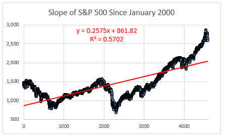
Chart 2 shortens the time frame to just the 12 months of 2017. By this time, we were free of the performance drag of the two bears, and the slope tells us that things had improved significantly. The slope of the 2017 market was 1.4574. What does a 1.45 degree price slope get us? A very robust 23.4% return. 2017 was a very good year for equity investors.
Chart 2
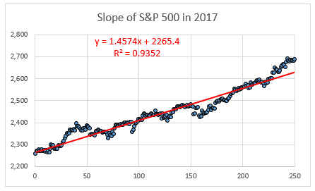
Chart 3 narrows the time frame and brings us up to the present day. We are now looking only at the price action in the S&P 500 for the last 3 months. Notice that the slope has shifted from a positive to a negative number. No surprise here because we all know how rotten the market has been since 2018 began. What does this slope get us in terms of annual returns? We have to extrapolate, because we only have one quarter of data. If we annualized the data, we would get an expected return of negative -8.8% for the full year.
There isn’t much predictive value in extrapolation, but the point is clear – a bad beginning to the year, marked by a reversal in the slope of the price trendline – is something we should pay close attention to.
Chart 3
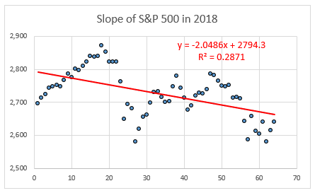
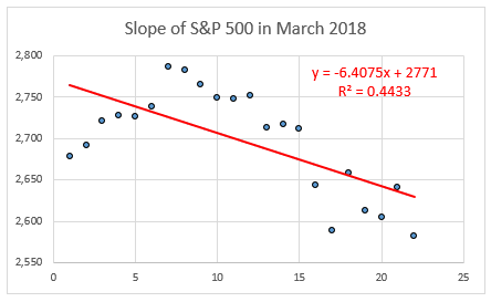
Chart 4 is the last and final chart in this series. It has the most narrow time frame, just the month of March 2018. Not to put too fine a point on it, the slope is even worse at this time frame. I’m not trying to alarm you by pointing this out, but March was not a good month, and the first quarter wasn’t good either. Once again, it’s not a good idea to extrapolate one month of data and reach a conclusion about what will happen during the rest of the year. Take notice, but don’t do anything silly like going to 100% cash tomorrow morning, or shorting the market at the opening bell. Let your cooler head prevail.
Chart 4
Final thoughts
I said at the beginning of this article that the equity market has lost its MOJO, and I hope these four charts have shed some light on how much MOJO has been lost. You probably have your own favorite indicator for price momentum, and I’m not suggesting that you switch to mine. I’m offering a slightly different perspective on the matter of momentum, which is almost always a good thing. Unless it’s a conspiracy theory or just a bone-headed idea.
I will continue to watch this indicator, and if I see something that is a dramatic shift, either good or bad, I will write a follow-up to this article.
(See my article “Bear Market Probability Calculation” here.)