
Here’s what happened last week, and what to watch for next week.
Chart 1. S&P periodic returns.
Market still firing on all cylinders. As I’ve said many times before: Don’t fight the tape.
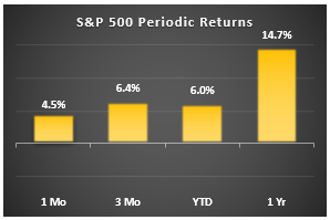
Chart 2. S&P drawdowns
Market dropped quickly in late January, tried to rally, dropped again in late March. Worst drawdown so far is 10%. Market now within shouting distance (1.3%) of the previous high. Will it cross the finish line? We’ll be watching this next week.
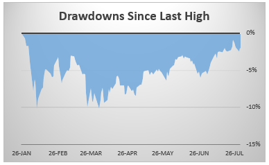
Chart 3. S&P key markers
This little table shows how far the market is from key markers like the previous low for this correction, and the key moving averages that technicians watch. S&P is well above support (2581) and all three moving averages. Watch for a breakout above 2873 or a dip below 2771 (50 dma). These two markers are what chartists are watching, and they’ll get motivated to do something when either marker is breached.
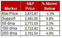
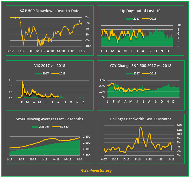
Chart 4. The market dashboard
I look at this dashboard after the close every day for a quick take on the market. It shows drawdowns, momentum, and volatility all on one graphic. Right now, the dip buyers have the upper hand. They have pushed the rally sellers up against the wall at 2872. I’ll be watching closely to see which of these two camps ultimately prevails.
My money is still on the dip-buyers. Where do you stand?
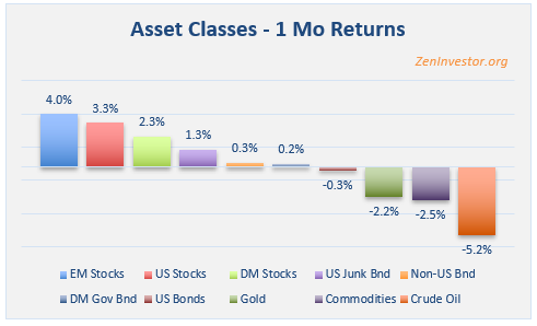
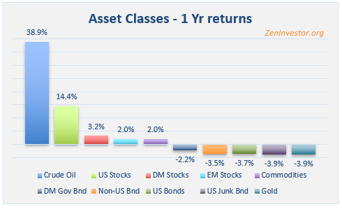
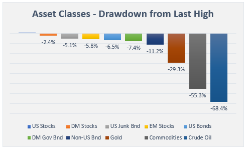
Charts 6, 7, 8. Asset Class Performance Through July
The winner in the 1 month sprint is Emerging Market Stocks.
The loser is Crude, after being on a tear all year.
The winner in the 1-mile race is Crude. See what I mean?
The loser is Gold, which has been under pressure from a strengthening dollar among other things.
Best in Class since each asset made it’s most recent high-water mark is US Stocks.
The loser is Crude. I’m getting a little whiplash with Crude, performance-wise.
Final thoughts
This has been a down-and-dirty recap of last week’s market action and some things to watch for next week. Comments have been positive, with a few folks pointing out that it took more than one minute to read the report. Fair enough. But once you become familiar with the format, which I will try to keep fairly consistent over time, I think your reading time will become shorter.
As always, if you like what you see, or have suggestions for improving this recap, leave a comment below.
This is my first exposure to the weekly recap so I can’t compare to the past. I think the key question for any writer of a weekly recap is who you’re trying to satisfy. I get or read analysis of most economic releases daily but I’d think most people with a “serious” interest would appreciate a quick take, your take, on at least the jobs report and the Fed meeting. I read weekly recaps that provide something I don’t already know or pay attention to, I don’t care that much whether it takes 60 seconds or 5 minutes to read, I just care about the value I feel I’m getting. I love the key markers and the market dashboard. At times when you see something significant happening with one of the dashboard graphs I’d appreciate if you point it out just like you pointed out the importance of the technical markers chartists will be watching.
I also appreciated the asset class returns although I would hope for a little more ‘why’. You touched on one of the reason golds has been under pressure and said you were getting whiplash from crude but why? Isn’t crude pretty volatile to start with? It might help to add a word or two making it clear whether its something readers should think about, pay attention to or simply enjoy the metaphor.
Thanks for all the effort you’re putting into these things and especially for the chance to provide feedback!!
I hope I’m not duplicating but I submitted the below once and didn’t get any confirmation it had gone through so one more attempt…
This is my first exposure to the weekly recap so I can’t compare to the past. I think the key question for any writer of a weekly recap is who you’re trying to satisfy. I get or read analysis of most economic releases daily but I’d think most people with a “serious” interest would appreciate a quick take, your take, on at least the jobs report and the Fed meeting. I read weekly recaps that provide something I don’t already know or pay attention to, I don’t care that much whether it takes 60 seconds or 5 minutes to read, I just care about the value I feel I’m getting. I love the key markers and the market dashboard. At times when you see something significant happening with one of the dashboard graphs I’d appreciate if you point it out just like you pointed out the importance of the technical markers chartists will be watching.
I also appreciated the asset class returns although I would hope for a little more ‘why’. You touched on one of the reason golds has been under pressure and said you were getting whiplash from crude but why? Isn’t crude pretty volatile to start with? It might help to add a word or two making it clear whether its something readers should think about, pay attention to or simply enjoy the metaphor.
Thanks for all the effort you’re putting into these things and especially for the chance to provide feedback!!
I like and can easily digest formats like this as I’m very visually oriented and like/easily understand charts. Thank you
The information and presentation is very good. But for me I buy double the S&P when in recession and buy double S&P short when entering into recession. So only information I am focused on is recession ending and recession beginning.
So I focus on data and tools that help me with recessions ending and recessions beginning.
Thanks, Howard. Did you know that I offer a recession forecast model to subscribers of my monthly newsletter? If you want to see a sample issue, just let me know. -Erik
Thanks,
I love macro so this gives me a technical view.
Thanks
Erik, I like it. I’m’ thinking what would really be meaningful is when there is something really important to know, some significant development,(technical breach etc.) that could have a meaningful impact on the market,economy, risk related etc. you could send out an ALERT, green could be a positive alert and red could be a negative alert…thanks