
What happened last week.
What we’re watching for next week.
Chart 1. S&P periodic returns.
Market finally broke through resistance at 2872, sending the rally-sellers scurrying for places to hide. All periods in this chart show positive returns. All together now… “Don’t fight the tape!”
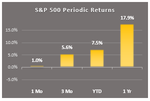
Chart 2. S&P drawdowns
This is the last time we’ll see this chart in this configuration, because the long correction of 2018 is now in the history books. The next time I show this chart it will be to describe the next correction we encounter. As corrections go, this one was unusual because it was very long in duration, but not very deep. It never got close to becoming a bear market.
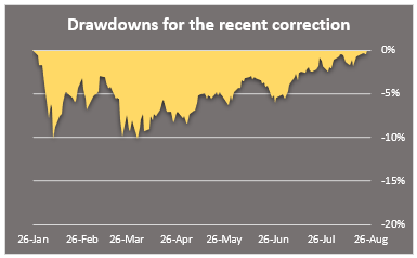
Chart 3. S&P key markers
This little table shows how far away the market is from key markers, like the previous low for this correction, and the key moving averages that chartists watch.
S&P now has a new support price (Friday’s close). The index is sitting comfortably above the key moving average markets that chartists like to watch. For now, all is well.
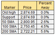
Chart 4. The market dashboard
This dashboard shows drawdowns, momentum, and volatility all on one graphic. As of last Friday everything seems to be moving in the Dip-Buyers direction.
The long, drawn-out battle between the bulls and bears has been decided. The bulls are the new boss, and the bears are in hiding. For now. Take a good look at today’s dashboard, because it really doesn’t get much better than this.
I’ve been doing this for long enough to know when we are in a sweet spot in the market, and this is one of those times. But be wary of complacency, because as soon as you take your eye off the market it will probably begin to misbehave again. Next time, the correction may not stop at -10%. It could get much worse than that.
As Christopher Walken said to Dennis Hopper after punching him in the nose during the interrogation scene in the movie True Romance, “It hurts, doesn’t it. It ain’t no kind of fun. And that’s as good as it’s gonna get, and it’s never gonna be that good again.”
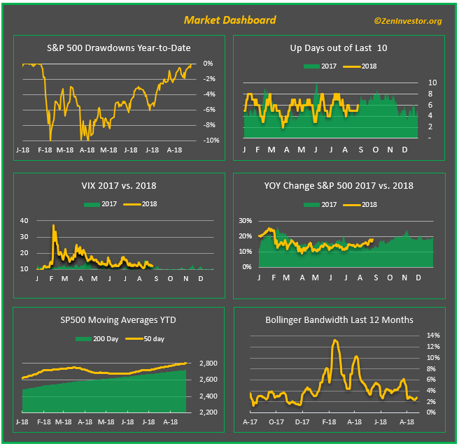
Chart 5. 10yr Treasury minus Fed Funds Rate (yield curve)
The pundits have been harping about the flattening curve since March, and this chart shows why. But here’s a fun fact: the curve isn’t really flattening, it’s compressing. And there’s a difference.
Compression means going from 5 to 1 on the spread. Flattening means going from 1 to zero. It may seem like semantics to us mere mortals, but to the bond vigilantes and stock market bears it’s a meaningful distinction.
We’ll be keeping an eye on this spread, which stands at 0.9% as of Friday. When (not if) it gets to about 0.5% we will be able to say the curve is flattening. And it will be a short trip from there to a proper inversion, which means a negative spread and a near-certainty of a new recession.
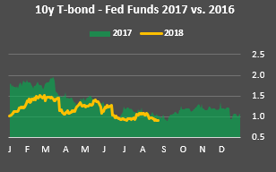
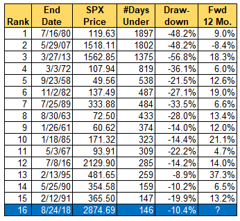
Chart 6. The end of a very long correction
Here is a chart I started keeping a couple of months ago when I started to realize how long this correction was lasting. Now that it’s over we can place it at #16 on the hit parade of all-time longest stretches when the market was under water.
What I find interesting is what the market did for the following 12 months after each of these long corrections ended. The historical record on this is encouraging. Just scan the far right column of the table and it’s clear that the market likes to run after being held down for prolonged periods. Will it do so this time?
Final thoughts
I’ve been getting calls and emails asking if I’ve changed my cautious outlook on the market. I understand why it seems that way, because I have been sounding more positive lately. But I haven’t changed my outlook. The market now has a new lease on life, but that could turn out to be short lived. I’m cautious, and my finger is never far from the sell button.
This has been another down-and-dirty recap of last week’s market action and some things to watch for next week. Comments so far have been very positive, and I thank all who took the time. I will keep tweaking this report, while also trying to keep it fairly consistent.
As always, if you like what you see, or have suggestions for improving this recap, leave a comment below, or email me at info@zeninvestor.org
Nice job, Erik – much appreciated the well-written report with good charts/data in support. One could of course ask for ‘more” – such as a chart or addition to the table showing the nuber of times that the flat yield curve preceded (and by how many months) the end of the bull markets/next recession. But then it would no longer be a 1-minute report. So again, nice. Thanks. best, dee
Thanks, Dee. I’m having some fun experimenting with this new format. I do want to keep is as brief as possible, so I will probably try mixing in at least one new chart or table each week along the lines you’re suggesting.
I’m interested in catching up with you. Send me an email so we can trade war stories.
Have you considered the Fear-Greed Index at https://money.cnn.com/data/fear-and-greed/? It is in “Greed” now.
Yes, that’s an interesting indicator. I may add it, if I can make room for it. Thanks for the suggestion.