
This is a tale of two corrections. The one we’re in now, and the last one from 2015. The intention is to find clues about where we might be headed next.
I’m going to show two charts, one for 2018 and one for 2015. To keep the comparison on an apples-to-apples basis I’m using the same number of days since the start of these two market episodes. The measuring stick that I will use is the slope of the decline, which reveals how quickly the market has dropped over the same time frame for both corrections. (If you want to know how the slope is calculated, see the footnotes at the end of this article.)
Chart 1. The 2018 correction, which is still in play.

The correction we are in now has gone on for 118 days – nearly 4 months. Is that significant? Yes, when you consider that a market that has been “under water” for 4 months is in the top one-tenth of one percent of all stretches between high-water marks since 1950. When a statistic gets to this level of rarefied air, I start to pay attention, which is why I’m bringing this to your attention.
The Slope
In any statistical analysis of the market, slope is an important piece of information. It describes the pace of a decline or a rise in an asset, like the stock market. Why is that important? Because it speaks to the urgency on the part of the sellers in a correction, or the buyers in a rally. Urgency is important because it indicates that things are changing in the market and the so-called “smart money” is aggressively trying to get ahead of the curve.
All you need to know at this point is that the slope of our current correction is -0.63. That won’t make sense until we compare it to the 2015 correction, which is next.
Chart 2. The 2015 correction.

In the above chart I plotted the track of the market over the same number of days – 118 – that I showed on the 2018 chart. Notice the slope of this correction: -0.22. That’s nearly one-third as steep as our current correction. The 2015 correction bottomed out at a decline of -14.2% from the high water mark. The 2018 correction has bottomed out, so far at least, at -10.44% from the high water mark.
Another way to frame the comparison is to say that the correction we’re in now is almost three times as steep as the last correction. Many of you will say “so what?” Here’s what it means to me. In any correction, or rally, the slope gives us a clue about how motivated the buyers or sellers are. In most markets, the slope is a positive 0.09. In big rallies, it can get as high as positive 0.74. In bear markets it can get as low as negative 0.82.
I think slope is an important data point, but not by itself. I include slope in my forecasting models, but it’s only one of many indicators.
Chart 3. The longest stretches spent under water.
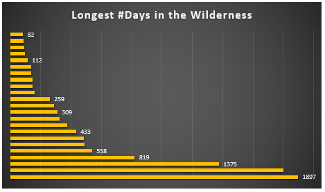
The above chart is for context. I call these long stretches of time between new highs “days in the wilderness.” I call them that because there is no wealth being created during these stretches. The market goes down, then up, then down again, over and over. But it doesn’t break through the previous high water mark, which it must do in order to create new wealth.
The duration of the current correction is shown at the top of the chart – 82 days. The longest stretch between new highs was 7.5 years, from 1972 to 1980. That was one of the worst bear markets in history. We’re a long way from being under water for 7.5 years, but we are now on the ignominious list of long-duration market episodes.
Technical details
The slope is derived from a least-squares regression line. Least squares is a statistical method used to determine a line of best fit by minimizing the sum of squares created by a mathematical function. A “square” is determined by squaring the distance between a data point and the regression line.
As always, if you would like further information about anything in this article, contact me through my website.