
Here’s what happened last week,
and what we’re watching for next week.
Chart 1. S&P periodic returns.
Market still looks good. All periods in this chart show positive returns. As I’ve said many times before: Don’t fight the tape. Now if the bulls could just retake Hill 2872 we could finally declare this correction officially over.
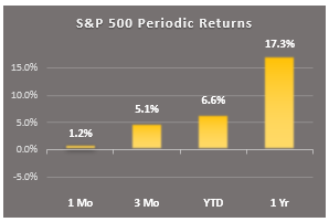
Chart 2. S&P drawdowns
Market now within 0.8% of its previous high. Once again the bulls failed to break through the wall at 2872. We’ll be interested to see whether the bears will become more aggressive next week.
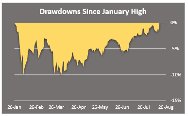
Chart 3. S&P key markers
This little table shows how far away the market is from key markers, like the previous low for this correction, and the key moving averages that chartists watch.
S&P is well above support (2581) and all three moving averages. Watch for a breakout above 2873 or a dip below 2792 (50 SMA). The chartists are watching these two levels, and they’ll probably speak out when either marker is breached.
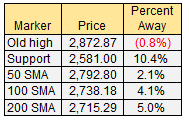
Chart 4. The market dashboard
This dashboard shows drawdowns, momentum, and volatility all on one graphic. As of last Friday everything seems to be moving in the Dip-Buyers direction.
But Hill 2872 is turning out to be a formidable resistance level. Since we’re only 0.8% away from 2872, it really shouldn’t be so hard to push through it. After all, the market can move by 0.8% easily. It’s happened many times before. What we have here is a serious head game between bulls and bears.
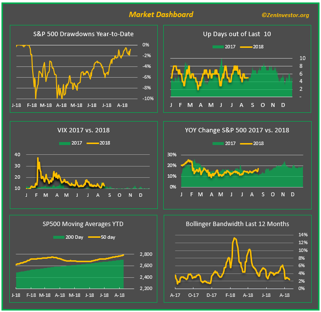
Chart 5. 10yr Treasury minus Fed Funds Rate (yield curve)
The pundits have been harping about the flattening curve since March, and this chart shows why. But here’s a fun fact: the curve isn’t really flattening, it’s compressing. And there’s a difference.
Compression means going from 1.5 to 1 on the spread. Flattening means going from 1 to near zero. It may seem like semantics to us mere mortals, but to the bond vigilantes and stock market bears it’s a meaningful distinction.
We’ll be keeping an eye on this spread, which stands at 0.95% as of Friday. When (not if) it gets to about 0.5% we will be able to say the curve has flattened. And it will be a short trip from there to a proper inversion, which means a negative spread and a near-certainty of a new recession.
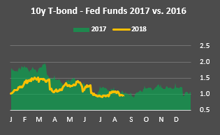
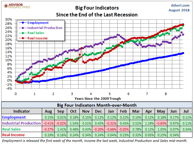
Chart 6. The Big Four Economic Indicators
I’ll end with this great chart from our friends Doug Short and Jill Mislinski at Advisor Perspectives. It neatly displays the Big Four economic indicators. We keep a close eye on this chart, and some other indicators of economic momentum. When we see these lines start to go nose down, it will be time to assume a more defensive position.
Final thoughts
Over the past few months I’ve been working with clients to create or update their contingency plans. If you have one in place, great. But if you don’t, now is the time to start working on it. Don’t wait until your house is on fire to buy insurance, because it will cost you an arm and a leg – that is, if you can get it at all.
This has been another down-and-dirty recap of last week’s market action and some things to watch for next week. Comments so far have been very positive, and I thank all who took the time. I will keep tweaking this report, while also trying to keep it fairly consistent.
As always, if you like what you see, or have suggestions for improving this recap, leave a comment below, or email me at info@zeninvestor.org