The Equity Risk Premium (hereafter the ERP) is the extra return that's available to equity investors above the return they could get by investing in a riskless investment like T-Bills or T-Bonds or cash.
It's one of the bedrock principles of market theory. If you want safety, buy government paper. If you want growth, buy stocks. It's really that simple.
The relevant question is this: How much of a premium is required to entice investors away from the safety of government paper and into the risky realm of the stock market? The ERP has varied widely over the last 119 years, which means that timing is important. If you leave the comfort and safety of government paper and begin to dabble in risky assets like stocks, how much compensation will you demand before you embark on that journey into the unknown?
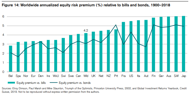
Chart 1. The long term view of the ERP
Chart 1 comes from the Credit Suisse Research Institute and it shows the long-term history of the equity risk premium by country, since 1900. The green bars represent the equity premium over T-Bills and the black line represents the equity premium over longer term government bonds.
Consider this the view from 10,000 feet and we will drill down as we go along.
The ERP has a range of 2.9% to 6.1% depending on the country and market represented. It should be noted that the U.S. is not the top dog in this competition. It comes in #8 out of 24 countries for which we have stock market data going back to 1900.
What I take from this chart is not just the wide range of ERP readings among countries, but the position of the leaders. Japan has been in a stagnant market since 1989 and yet it is the leader of the pack. Surprising to me. Germany is #4 in spite of the fact that they lost two world wars and were forced to make enormous reparations to other European nations. Recall that Adolph Hitler rose to power on a political platform of making Germany great again, which meant rebuilding infrastructure and boosting the economy.
No matter which country you prefer, one thing is universal. Stocks outperform government paper over the long term.
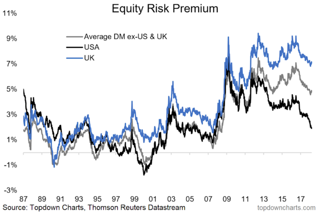
Chart 2.
Chart 2 comes to us from topdowncharts.com. The time frame is much shorter - 1987 to today instead of 1900 to today.
This chart underscores the variability of the ERP over time. I'll say it again - timing is everything when making a bet on the stock market.
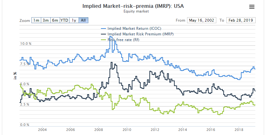
Chart 3.
Chart 3 narrows the time frame from 1987-present, to 2002-present. Again we see a wide variation in the ERP, further bolstering my thesis that timing matters when allocating to risk assets like stocks.
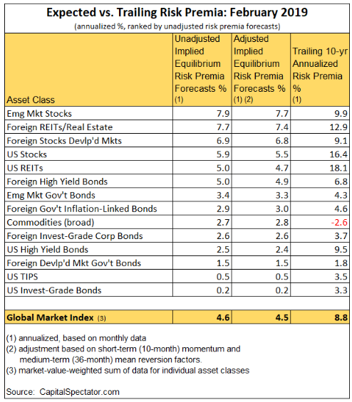
Chart 4.
Chart 4 brings us to the conclusion of this article. It comes from capitalspectator.com and it's a must read for me every month. It not only shows the ERP for the U.S. stock market, it also shows the ERP for other markets and asset classes.
My takeaway
As Chart 4 shows, ERPs vary widely among markets and asset classes. Strict Buy & Hold investors simply take whatever the market gives them and they don't make adjustments along the way except to periodically reset their allocations back to their original percentages.
Buy & Adapt investors, on the other hand, have full control over the way they allocate funds along the spectrum of risky assets to riskless assets. One way to gauge which assets are more attractive than others is by comparing their ERPs, both historical and forecasted.
And that is the point of the article. Ask yourself this question: Would you rather own Emerging Market Equities with an expected ERP of 7.7% over the next 10 years, or Investment Grade Corporate bonds with an expected ERP of 0.2% over the same period?
The way I do it is to look at the ERPs at the end of each year and tweak my allocations so that I'm overweight the high ones and underweight the low ones. It's just common sense.


